How to value growth?
If a company has strong earnings power relative to assets, then the firm likely enjoys some barriers to entry. This difference is known as the franchise value. If these barriers are sustainable, then the franchise value is strong and the firm is said to have a sustainable competitive advantage (aka wide moat). In this case, growth will likely create more value. On the otherhand, if there are no barriers to entry, growth will likely lead to value destruction. Only growth within the franchise will create value.
If we believe a firm has a wide moat, then how do we value growth? It is important to view growth in terms of expected returns, rather than trying to assign a dollar value or share price.
This post will cover how to calculate expected return by using the following formula:
Expected Returns = Distribution Yield + Earnings Growth
The Distributions are the total returns going back to the owners and shareholders. This includes:
- Dividends
- Share repurchases
- Interest expense
- Net issuance of debt
However, we need to normalize this by the value of the firm, so we divide by the Enterprise Value.
Enterprise Valueis calculated asMarket Cap + Long Term Debt - Cash
Thus, Distribution Yield = Distributions / Enterprise Value
Now what about earnings growth? There are two ways to estimate earnings growth. The first is to look at historical growth in earnings. The second is to look at return on invested capital (ROIC), which is dependent on assessing the capital allocation within the firm. The second approach is more complex, and I will save that for another post. For now, we will use the historical earnings approach.
Once we have an estimate of Earnings Growth based on historical earnings and revenues, then we add that growth rate to the Distribution Yield to get our Expected Returns. This is the % we would expect to get back on our investment each year.
Expected returns example with Gentex
Let’s run through an example with Gentex. This is a firm with relatively stable growth rates, in a slow changing industry. Although there are numerous disruptors on the horizon (self driving cars, AI etc…). I think it’s a good candidate to try out the expected returns approach using historical earnings.
Data import and setup
# Import tools we will be using, and configure general settings
import matplotlib.pyplot as plt
import pandas as pd
%matplotlib inline
pd.set_option('display.max_rows', 10)
pd.set_option('display.max_columns', 10)
The first thing I did was download the 30 year financial historical data from Gurufocus. After a little bit of clean up in Excel, I imported into a pandas dataframe so we could run our analysis.
# CSV data downloaded from Gurufocus
gntx_data = pd.read_csv("gntx_export.csv", index_col=['Year'])
Here’s the the initial load looks like.
gntx_data
Because it’s historical data over time, we need to transpose the dataframe so that the dates become the row indexes.
# Transpose data and sets datetime
gentex = gntx_data.T
gentex.index = pd.to_datetime(gentex.index)
gentex
Finding the Distribution Yield
Enterprise Value
First, let’s take a look at the Enterprise Value.
gentex_enterprise_value = gentex['Enterprise Value']
fig, ax = plt.subplots(figsize=(8,4))
ax.grid(color='grey', linestyle='dotted', axis='y', which='major')
ax.bar(gentex.index, gentex_enterprise_value, width=250, label='EV-to-EBIT')
ax.xaxis_date()
ax.legend()
ax.set_xlabel('Year')
ax.set_ylabel('Value')
ax.set_title('Enterprise');
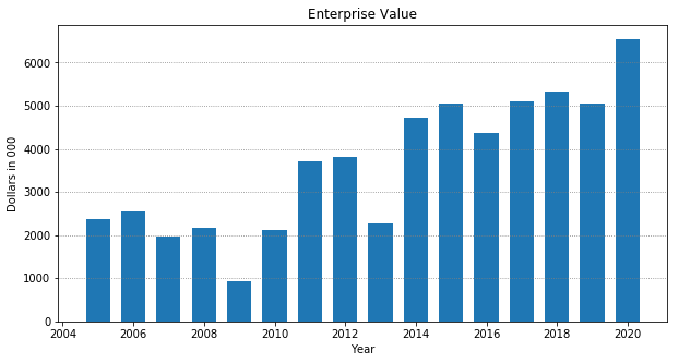
We see that the enterprise value has been steadily increasing over the years.
Distributions
Now we want to add up all the Distributions which go to shareholders and outside parties. Gentex reported no interest expense, as they do not carry any long term debt. So we just add dividends, stock repurchases, and net issuance of debt.
gentex_distributions = gentex['Cash Flow for Dividends'] + gentex['Repurchase of Stock'] + gentex['Net Issuance of Debt']
# Data reports as a negative number, so we need to flip the sign
gentex_distributions = gentex_distributions * -1
Once we have the total Distributions we divide by Enterprise Value to get the Distribution Yield
gentex_distribution_yield = gentex_distributions / gentex_enterprise_value
gentex_distribution_yield_ma = gentex_distribution_yield.rolling(5).mean()
We then plot the last 15 years data, along with a 5 year moving average to get a better approximation of what the Distribution Yield was over time.
print(f'Distribution Yield last 5 years: \n{gentex_distribution_yield.tail(5)}')

fig, ax = plt.subplots(figsize=(8,4))
ax.grid(color='grey', linestyle='dotted', axis='y', which='major')
ax.bar(gentex.index, gentex_distribution_yield, width=250, label='Distribution Yield')
ax.plot(gentex.index, gentex_distribution_yield_ma, color='orange', label='5-year ma')
ax.xaxis_date()
ax.legend()
ax.set_xlabel('Year')
ax.set_ylabel('Value')
ax.set_title('Distribution Yield');
Distribution Yield last 5 years:
2015-12-31    0.055139
2016-12-31    0.061067
2017-12-31    0.083890
2018-12-31    0.155721
2019-12-31    0.087860
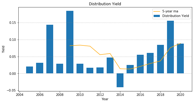
We can see that over the years, the yield has fluctuated between 0-10%, with it mostly oscillating at the 5% mark. To be conservative, let’s use 8%.
Estimating Earnings Growth
The method we are using is to look at historical earnings growth and come to an estimate of what percentage return shareholders should expect from future earnings. We can also look at revenue growth as well to triangulate on a number we think is a conservative representation to use in our calculations.
Historical revenue growth
Let’s plot the % change in revenue over the past few years:
revenue_pct_change = gentex['Revenue'].pct_change() * 100
revenue_pct_change_ma = revenue_pct_change.rolling(5).mean()
print(f'Revenue growth over the past 5 years: \n{revenue_pct_change.tail(5)}')

fig, ax = plt.subplots(figsize=(8,4))
ax.grid(color='grey', linestyle='dotted', axis='y', which='major')
ax.bar(gentex.index, revenue_pct_change, width=250, label='Revenue Growth')
ax.plot(gentex.index, revenue_pct_change_ma, color='orange', label='5-year ma')
ax.xaxis_date()
ax.legend()
ax.set_xlabel('Year')
ax.set_ylabel('Value')
ax.set_title('Revenue Growth');
plt.ylim(top=30, bottom=-20)
Revenue growth over the past 5 years:
2015-12-31    12.222238
2016-12-31     8.765575
2017-12-31     6.906086
2018-12-31     2.183497
2019-12-31     0.921342
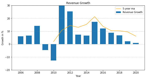
The chart shows revenue growth in a downward trend over the past 4-5 years, going from 12% growth down to 1%. If we plot it with the 5-year moving average, it looks like revenues have been growing at historical trend of 8-10%. The question is whether we believe this downward trend will continue due to something systematic, or if it is just part of the business cycle.
To be conservative, let’s assume revenues will grow between 1-3% a year.
Historical earnings growth
Now let’s do the same thing, but for earnings growth.
eps_pct_change = gentex['Earnings per Share (Diluted)'].pct_change() * 100
eps_pct_change_ma = eps_pct_change.rolling(5).mean()
print(f'Earnings growth over the past 5 years: \n{eps_pct_change.tail(5)}')

fig, ax = plt.subplots(figsize=(8,4))
ax.grid(color='grey', linestyle='dotted', axis='y', which='major')
ax.bar(gentex.index, eps_pct_change, width=250, label='Earnings Growth')
ax.plot(gentex.index, eps_pct_change_ma, color='orange', label='5-year ma')
ax.xaxis_date()
ax.legend()
ax.set_xlabel('Year')
ax.set_ylabel('Value')
ax.set_title('Earnings Growth');
plt.ylim(top=40, bottom=-20)
Earnings growth over the past 5 years:
2015-12-31    10.204082
2016-12-31    10.185185
2017-12-31    18.487395
2018-12-31    14.893617
2019-12-31     1.851852
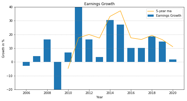
It looks like even with revenue in decline, earnings have been growing at a solid 10-20% each year up until this year. Let’s plot revenue and earnings together to see if we can triangulate on a number.
# plt.grid(color='grey', linestyle='dotted', axis='y', which='major')
# plt.plot(revenue_pct_change_ma.tail(15))
# plt.plot(eps_pct_change_ma.tail(15))
# plt.legend(['Revenue Growth 5-year ma', 'Earnings Grwoth 5-year ma'])
# plt.title('Earnings & Revenue Growth')
# plt.xlabel('Year')
# plt.ylabel('% Growth')
# plt.ylim(top=30, bottom=-15)

fig, ax = plt.subplots(figsize=(8,4))
ax.grid(color='grey', linestyle='dotted', axis='y', which='major')
ax.plot(gentex.index, revenue_pct_change, label='Revenue Growth')
ax.plot(gentex.index, eps_pct_change, color='orange', label='Earnings Growth')
ax.xaxis_date()
ax.legend()
ax.set_xlabel('Year')
ax.set_ylabel('Value')
ax.set_title('Earnings & Revenue Growth');
plt.ylim(top=40, bottom=-20)
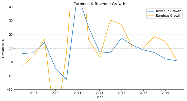
It really is a judgement call. Based on historical earnings and revenue growth, I would say we could use somewhere between 3-7% for estimated growth of future earnings.
Calculating Expected Returns
Now that we just need to add Dividend Yield to Earnings Growth to get our Expected Returns
#expected_return_historical_revenue = distribution_yield + revenue_growth
estimated_distribution_yield = .08
estimated_earnings_growth_high = .07
estimated_earnings_growth_low = .03
expected_return_historical_earnings_high = estimated_distribution_yield + estimated_earnings_growth_high
expected_return_historical_earnings_low = estimated_distribution_yield + estimated_earnings_growth_low
print(f'Expected Returns are somewhere between: {expected_return_historical_earnings_low:.2f} and {expected_return_historical_earnings_high:.2f}')
Expected Returns are somewhere between: 0.11 and 0.15
This means, that for every dollar invested, we would expect to get between $0.11 - $0.15 back on our investment each year.
Multiple Expansion and Compression
There is one more factor that affects returns. And that is the P/E ratio, or the multiple at which the company is valued at relative to earnings. If the multiple expands, and the P/E ratio goes up, then the returns are enhanced. If the multiple compresses, and the P/E ratio goes down then the returns are diminished. This is one reason why investing in companies with high P/E ratios is riskier, since returns will diminish as P/E ratios go down.
One way to protect against multiple compression, is to use Enterprise Value to EBIT to evaluate multiples. This is known as the EV to EBIT ratio. The higher the ratio, the more exposed to multiple compression. Typically, an EV to EBIT ratio of 15 is the cutoff for value investors, and many will exit the investment once EV to EBIT goes above 20-25. Let’s look at the EV to EBIT ratio for Gentex over the past few years.
gentex_ev_to_ebit = gentex['EV-to-EBIT']
fig, ax = plt.subplots(figsize=(8,4))
ax.grid(color='grey', linestyle='dotted', axis='y', which='major')
ax.bar(gentex.index, gentex_ev_to_ebit, width=250, label='EV-to-EBIT')
ax.xaxis_date()
ax.legend()
ax.set_xlabel('Year')
ax.set_ylabel('Value')
ax.set_title('Enterprise Value to EBIT')
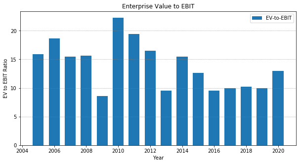
The plot shows the EV to EBIT ratio of Gentex expanding beyond the 9-10 in recent history to 13. It’s getting close to the 15x mark. This is close to the limit of which would make a value investor look elsewhere. However, if we believe the firm has strong barriers to entry and will continue to sustain its moat, then the higher EV to EBIT ratios are justified. As Warren Buffet said, It’s better to buy a wonderful company at a fair price, then a fair company at a wonderful price.